

Mobile-First Website Design: Checklist for Indian Businesses

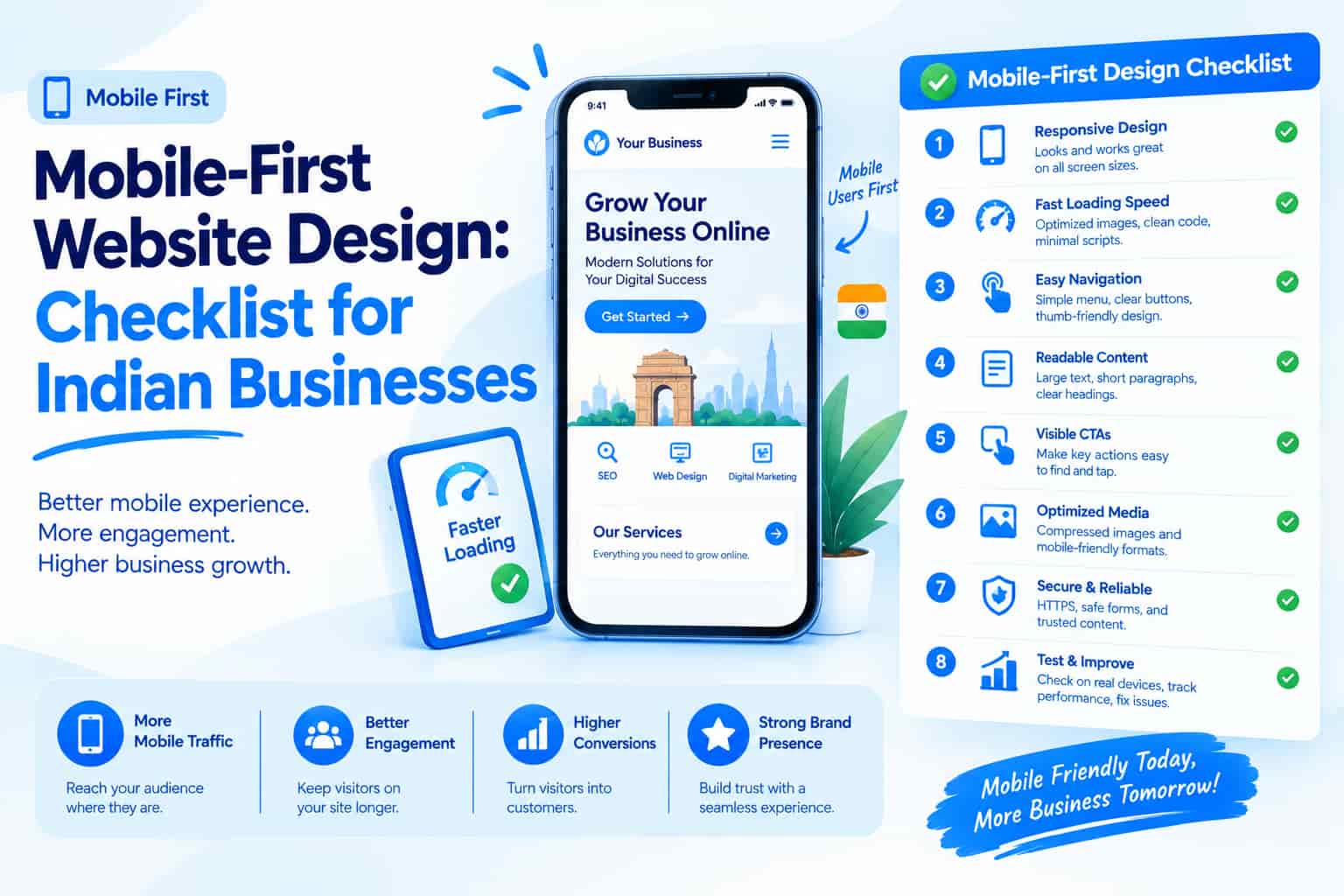
For most Indian businesses, the majority of website visitors arrive on a phone, often a mid-range Android device on mobile data. A site that looks great on an office monitor but struggles on a small screen quietly loses customers every day. Google also uses the mobile version of your pages for indexing, so mobile-first website design matters for both conversions and SEO. This guide explains what mobile-first means, the design principles that work and how to test your site before launch.
What Mobile-First Design Means
Mobile-first means designing for the smallest screen first, deciding what truly matters, and then expanding the layout for tablets and desktops. The approach forces focus: one clear message, one main action and fast loading. It is very different from simply shrinking a desktop site. A responsive website adapts its layout, images and navigation to every screen size while using the same address and the same content, which keeps things consistent for visitors and search engines alike.
Why It Matters in India
Many customers never open your website on a computer. They browse on phones, often over variable 4G connections, and they expect pages to load quickly and be easy to use with a thumb. Google predominantly uses the mobile version of a page for indexing and ranking, so a weak mobile experience can hold back your visibility as well as your sales. Easy tapping, calling and messaging, on the other hand, turn visitors into enquiries.
Put the Main Action on the First Screen
Visitors decide within seconds whether a site can help them. Make your main action, whether it is call, WhatsApp, book or buy, visible without scrolling, and consider a sticky call or chat button that stays within reach as people move down the page. Replace vague headlines with a clear statement of what you offer and where, so nobody has to hunt for basic information.
Make It Easy to Tap and Read
Buttons and links need enough size and spacing for thumbs. A common guideline is around 44 to 48 pixels in height, because tiny links packed together cause mis-taps and frustration. Text should be comfortably readable, with a body size of at least 16 pixels, short paragraphs and strong contrast, since light grey text on a white background is hard to read in bright sunlight. Keep navigation simple with a short menu, a clear search option and a tidy mobile menu rather than deep dropdowns that are awkward on touchscreens.
Shorten Forms and Offer Easy Contact
Every extra form field loses some visitors, so ask only for name, phone number and what the person needs. Use the right keyboard for each field, such as a numeric keypad for phone numbers, and allow autofill where possible. Beyond forms, make contact effortless with tap-to-call links, WhatsApp chat links with a pre-filled message, map links for directions and a visible address and opening hours. Many mobile visitors prefer a quick call or chat over typing.
Optimise Speed and Images
Speed is part of design. Compress images, serve sizes suited to each screen, use modern formats and avoid heavy sliders or autoplay videos that slow everything down. Check your Core Web Vitals regularly, because speed affects both rankings and sales. Our guide to modern SEO and site performance explains how technical quality connects with visibility.
Common Mobile Design Mistakes
Several mistakes appear again and again. Pop-ups that cover the whole screen and are hard to close frustrate visitors, horizontal scrolling and cut-off tables make pages feel broken, and text placed inside images cannot be resized or translated. Fixed bars that take up too much of the screen, tiny low-contrast fonts and features that rely on mouse hovering all work against mobile users. Fixing these basics often lifts conversion rates quickly.
Mobile-First and SEO
For search engines, the mobile and desktop versions of your site should carry the same core content, headings, structured data and meta tags. Do not block CSS, JavaScript or images from crawlers, and prefer a responsive design over a separate mobile website. The Page Indexing and Core Web Vitals reports in Google Search Console will show whether Google sees your mobile pages correctly.
How to Test Your Mobile Site
Do not rely on a desktop browser alone. Open your site on at least two real phones with different screen sizes and complete the main action as a customer would, whether that is booking an appointment or checking out. Test over mobile data rather than office Wi-Fi, use PageSpeed Insights and device emulation for diagnostics, and ask a few friends or customers to try it and tell you where they hesitate. Those small observations often reveal problems no tool will flag.
Frequently Asked Questions
Do I need a separate mobile website?
No. A responsive design that adapts to every screen is the standard and the easiest approach to maintain.
Does mobile design affect SEO?
Yes. Google primarily uses the mobile version of pages for indexing, so mobile quality directly affects visibility.
How can I see how much of my traffic is mobile?
Check the device category report in Google Analytics 4, then prioritise the pages that receive the most mobile visits.
Conclusion
Mobile-first design puts your customers' phones at the centre of your website: clear first-screen actions, large tap targets, readable text, short forms, fast images and effortless contact options. Test on real devices and keep improving based on data.
OM Enterprises designs fast, mobile-first, SEO-ready websites with WhatsApp and call integration. Get a free website consultation and turn mobile visitors into customers.